css position(static, absolute, relative, fixed, sticky)
html의 element의 위치를 이동시키고자 할 때
position의 값이 어떻게 설정되어있냐에 따라 이동 위치가 달라진다.
static
Position의 기본 설정 값은 'static'으로 설정되어 있다.
<!DOCTYPE html>
<html>
<head>
  <meta charset="utf-8">
  <meta name="viewport" content="width=device-width">
  <title>JS Bin</title>
</head>
<body>
  <section id="container">
    <div></div>
    <div></div>
    <div id="item"></div>
    <div></div>
    <div></div>
    <div></div>
    <div></div>
    <div></div>
    <div></div>
  </section>
</body>
</html>
#container{
background:blue;
}
div{
width:70px;
height:70px;
background:yellow;
margin-bottom:20px;
}
#item{
background:red;
left:20px;
top:20px;
}
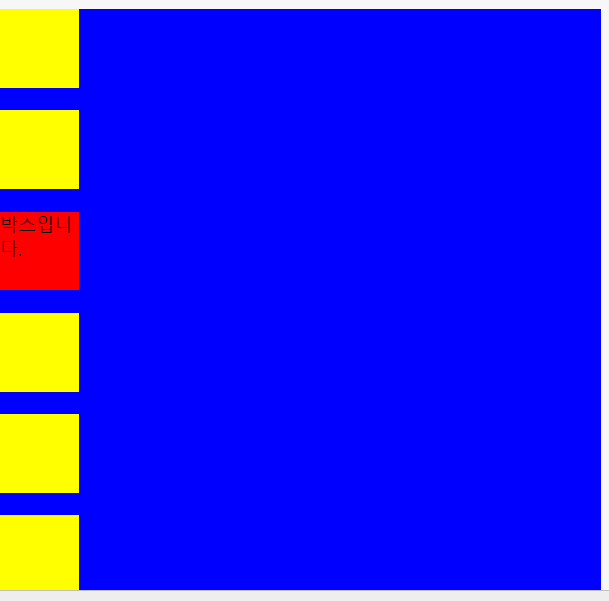
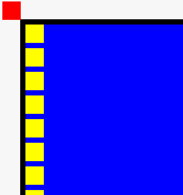
위의 css코드에서 빨간색 박스(id="item")의 위치를 top:20px , left:20px로 설정했다.
하지만 박스가 이동하지 않고 자신의 위치를 지키고 있다.
그 이유는 position이 기본적으로 static의 값으로 설정되어있기 때문이다.
position이 static 값으로 설정되어있으면 위치를 이동시킬 수 없다.
relative
element의 위치를 이동시키기 위해서는 'relative'를 사용해야 한다.
#container{
  background:blue;
}

div{
  width:70px;
  height:70px;
  background:yellow;
  margin-bottom:20px;
}
#item{
  background:red;
  left:20px;
  top:20px;
  position:relative;
}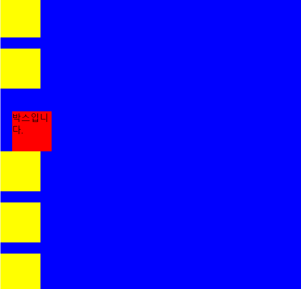
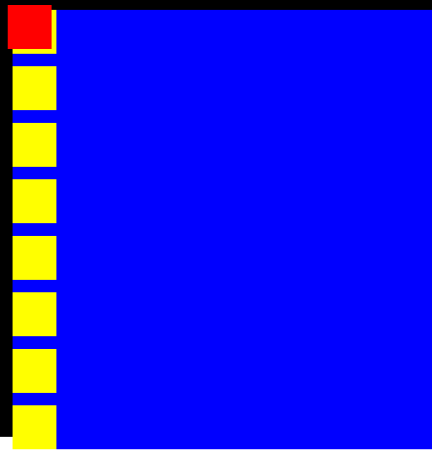
css코드에서 빨간색 박스(item) 속성을 position:relative로 설정하니 빨간색 박스가 위치 값만큼 이동한 모습을 볼 수 있다.
또한, 요소의 원래(기본) 위치를 기준으로 위치값 만큼 이동하였다.
그리고 이 원래 기본 위치는 부모 요소 기준으로 되어있다
#container{
  background:blue;
  left:40px;
  top:40px;
  position:relative;
}

div{
  width:70px;
  height:70px;
  background:yellow;
  margin-bottom:20px;
}
#item{
  background:red;
  left:20px;
  top:20px;
  position:relative;
}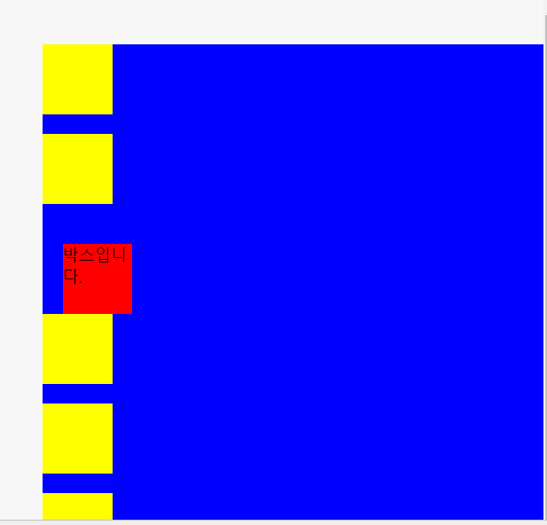
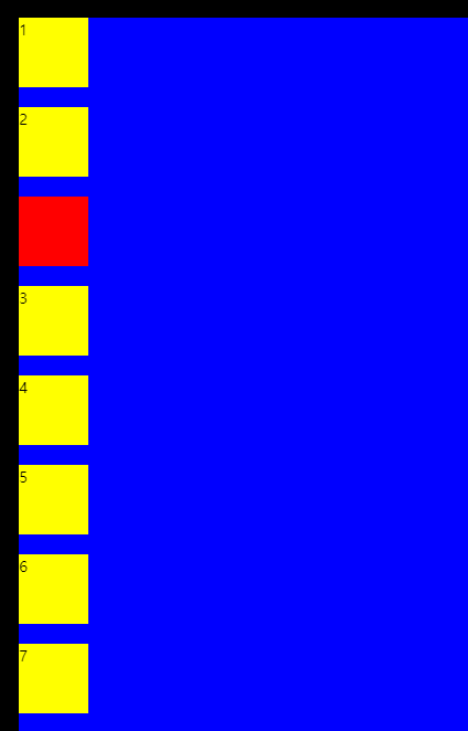
위의 css코드에서 파란색 박스를 top,left 로부터 40px씩 멀어지게 했다.
그리고 빨간색 박스는 파란색 박스로부터 top,left 20px 씩 멀어진 모습을 볼 수 있다.
파란색 박스를 이동 시켜도 빨간색 박스는 파란색 위치를 기준으로 이동한 모습을 볼 수 있다.
즉, relative의 기본 위치는 부모 요소가 기준이 되고,
자신의 기본 위치에서 top, left, right, bottom의 설정한 값만큼 이동하게 해 준다.
absolute
absolute는 해당 element를 감싸고 있는 부모 박스들 중에서 가장 근접한 부모 박스의 position 값이 static이 아닌 경우( relative, absolute, fixed 등)에 그 부모 박스 기준에 맞춰 움직인다.
(만약, 바로 상위 부모 박스가 static이라면, 가 다음 부모 박스의 position 값을 확인한다.)
<!DOCTYPE html>
<html>
<head>
  <meta charset="utf-8">
  <meta name="viewport" content="width=device-width">
  <title>JS Bin</title>
</head>
<body>
  <article>
    <section id="container">
      <div></div>
      <div></div>
      <div id="item"></div>
      <div></div>
      <div></div>
      <div></div>
      <div></div>
      <div></div>
      <div></div>
    </section>
  </article>
</body>
</html>
section 태그 위에 article이라는 부모 박스를 추가했다.
article{
  background:black;

  position:relative;
}

#container{
  background:blue;
  margin-left:100px;
  position:static;
}

div{
  width:70px;
  height:70px;
  background:yellow;
  margin-bottom:20px;
}
#item{
  background:red;
  left:20px;
  top:20px;
  position:absolute;
}
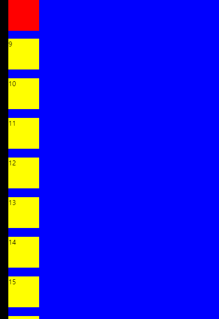
그리고 최상위 박스(body를 제외한)인 article의 position을 relative로 설정하고
그다음 박스인 section태그(class=container)의 position을 static이라 설정하고, margin-left를 100px을 주었다.
(즉, 검은색 박스 === article)
(파란색 박스=== section)
그러면 이때의 빨간색 박스(id=item)의 모습은 어떻게 될까?
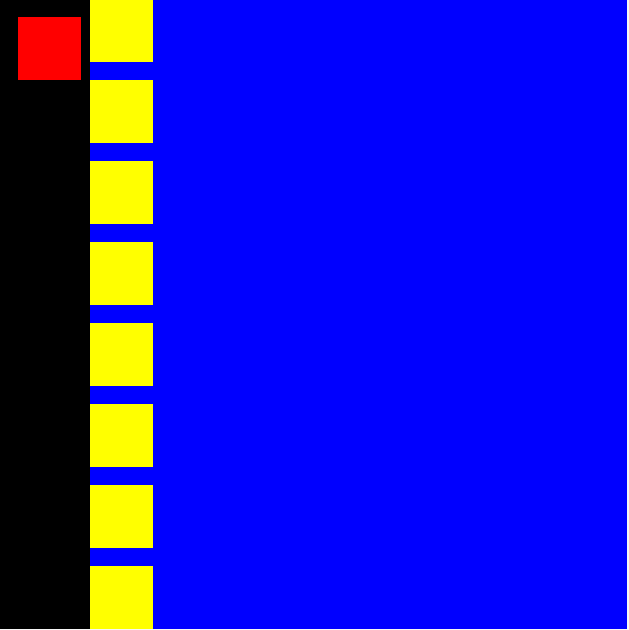
바로 검은색 박스 위치를 기준으로 이동하게 된다.
빨간색 박스의 바로 윗 부모 요소인 파란색 박스의 postion값은 static이므로,
그다음 부모 요소를 검사하게 된다. 그리고 검은색 박스의 position값이 relative이기 때문에
absolute로 설정된 빨간색 박스는 검정색 박스의 위치 기준으로 top, left 값만큼 이동했다.
또한, 빨간색 박스가 원래 위치하고 있던 자리는 그다음에 있던 노란색 박스가 위로 올라와서 빈 공간을 메웠다.
즉, absolute는 해당 요소를 감싸고 있는 부모 박스들 중에서 가장 근접한 부모 박스의 position 값이 static이 아닌 ( relative, absolute, fixed 등) 부모 박스 기준에 맞춰 움직인다.
또한, 이동한 자리는 다음 요소로 메워지게 된다.
fixed
fixed는 박스들이 기준이 아니라 눈에 보이는 브라우저가 기준이 된다.
article{
  background:black;
  left:80px;
  top:80px;
  position:relative;
}

#container{
  background:blue;
  top:20px;
  left:20px;
  position:relative;
}

div{
  width:70px;
  height:70px;
  background:yellow;
  margin-bottom:20px;
}
#item{
  background:red;
  left:20px;
  top:20px;
  position:fixed;
}
위의 css코드에서 item 값(빨간색 박스)의 position을 fixed로 설정한 경우의 그림은??
위와 같이 부모 박스들의 위치가 기준이 아닌 눈에 보이는 브라우저를 기준점으로 이동하게 된다.
또한, 스크롤을 내려도 그 위치는 고정되어 계속 같은 위치에 보이게 된다.
하지만 검은색 박스, 파란색 박스를 원래 위치로 되돌릴 경우 겹치는 경우가 있다.
article{
  background:black;

  position:relative;
}

#container{
  background:blue;
  top:20px;
  left:20px;
  position:relative;
}

div{
  width:70px;
  height:70px;
  background:yellow;
  margin-bottom:20px;
}
#item{
  background:red;
  left:20px;
  top:20px;
  position:fixed;
}
fixed가 부모 요소의 위치는 무시하고 브라우저 기준으로 이동하므로 겹치는 현상이 발생할 수 있다.
그래서 position을 fixed로 설정하면 부모 요소를 무시한 채 브라우저 기준으로 위치를 이동하게 되며,
겹치는 현상이 발생할 수 있으므로 주의를 해야 한다.
sticky
position을 fixed로 설정하면 겹치는 문제가 발생할 수 있다.
그러면 겹치지 않고 요소들의 순서를 유지하면서 고정할 순 없을까??
이건 바로 sticky 값을 통해 해결할 수 있다.
article{
  background:black;

  position:relative;
}

#container{
  background:blue;
  top:20px;
  left:20px;
  position:relative;
}

div{
  width:70px;
  height:70px;
  background:yellow;
  margin-bottom:20px;
}
#item{
  background:red;
  left:0px;
  top:0px;
  position:sticky;
}
즉, sticky는 본인의 기본 위치를 유지하면서, 스크롤을 내렸을 경우 화면에서 사라지지 않고 left, top 등 설정한 값만큼 위치로 이동하여 그 자리(화면)에 고정되어 있다. 그리고 스크롤을 올리면 다시 기본 위치로 돌아간다.